alfa1
Well-Known Member
Do you have a sidebar?
Dadparvar
Active Member
Do you have a sidebar?
(btw, let me update it: with the 2.8.8 version that released a few minutes ago, now the list has some problems)
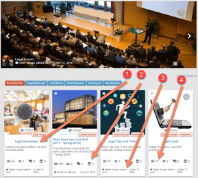
with removing overflow hidden and other related stuffs like ellipses and ... the result became:
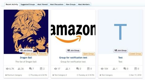
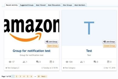
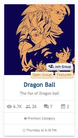
1. tagline show all the text. it makes the cards become messy as some of them have short taglines and some long. so the short ones will have white space. also the text is now ltr instead of center
2. when the taglines are different, the the stats row are in different places too. compare first groups's stats row with the second. a few pixell below each other.
3. category name and date is now showing the full text and the result is messy when category of some card is short and the other is long. same with the date.
4. when a group has 4 figures stats (lets say 1000 views or 2000 discusstions) then the numbers will go to second row, and the result is again messy
all of these problems will be fixed with marquee effect

