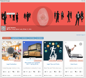
Group Card & Banner display issues

alfa1

Well-Known Member
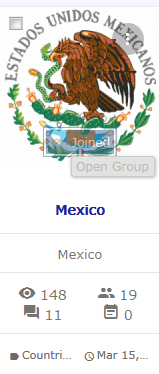
Screenshot-2018-4-19 Groups Forum.webp

There are 3 problems with the 'Open Group' banner:
  1. The 'Join' button is invisible.
  2. The 'Open Group banned touches the join button
  3. The Open Group banner does not use normal banner colors.
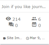
Screenshot-2018-4-19 Groups Forum(1).webp

Other display issues you can see:
  1. group supporting text is unreadable when its longer than 24 characters. So its not useful at all for my site. Most people just repeat the name of the group. Which is pointless.
  2. category cannot be read as its cut off.
  3. data is cut off and cannot be read.
  4. Events are turned off in this category, but event icons displays. Always showing 0 events.
Please let us turn these 4 things off. I only want to display things to my users that they can understand. No cut off text.
 
Last edited:
The reason I want it gone for my site is that its too short to be of use. I cannot explain what the group is about in 22 characters. If we can make the tagline longer then it would be useful.
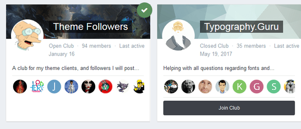
Honestly the IPS group card is brilliant. Its twice as wide and allows for much better information:

Screenshot-2018-4-21 Clubs - Invision Community.webp

It needs settings:
  • max image height
  • tagline length (0 to turn off)
  • display views Y/N
  • display member count Y/N
  • display message count Y/N
  • display event count Y/N
  • display category Y/N
  • display last active date Y/N
  • date format
  • display member avatars Y/N
  • display leader avatar Y/N
 
Last edited:
You can make the social group cards wider by adjusting the amount of colums you show.

The user thumbs are nice but the tag line gives valuable info.

At least make it optional with check marks in ACP:
“Show Tagline”
“Show Member Avatars”

So each admin can decide for himself.
 
tagline is important. in groups list is something that makes the viewers to open groups for more information.
(it could be useful if you also would add an option to let us turn on/off marquee effect for it, in case the tagline is longer than the width of container, then the text gets the marquee effect to show the whole line to users.)
 
@alfa1 I don't know what is the width of your site that your card is looking that much bad. But in my side they look so good. (even with 4 each row)
 

Attachments

  • 1111.webp
    1111.webp
    100.9 KB · Views: 197
Back
Top