You are using an out of date browser. It may not display this or other websites correctly.
You should upgrade or use an alternative browser.
You should upgrade or use an alternative browser.
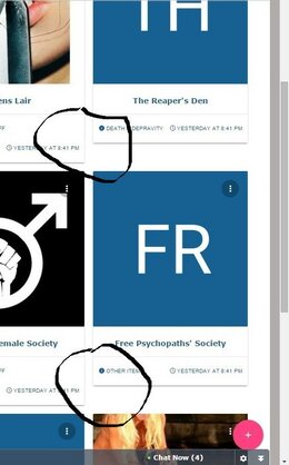
Fixed some groups not "aligned" in main group display
- Thread starter zoldos
- Start date
-
Duplicate Guests can see thread titles of private groups
- Started by alfa1
- Replies: 1
- Resolved Bugs
-
Fixed 2.9.0.b - unregistered users may browse private group threads
- Started by janslu
- Replies: 6
- Resolved Bugs
-
Fixed Clicking on slider arrow opens group.
- Started by alfa1
- Replies: 2
- Resolved Bugs
-
Fixed Argument 1 passed to XenForo_Template_Helper_Core::helperUserName() must be of the type array
- Started by alfa1
- Replies: 6
- Resolved Bugs
-
Fixed Cannot find invited members
- Started by alfa1
- Replies: 2
- Resolved Bugs

