alfa1
Well-Known Member
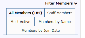
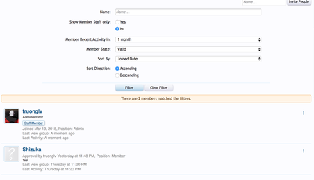
The members tab looks like this:

There are too many unnecessary tabs.
The group members tabs have two functions:
To display group members there now are tabs to sort members by:
This way the page will be much easier to use.

There are too many unnecessary tabs.
The group members tabs have two functions:
- display group members
- display group staff
To display group members there now are tabs to sort members by:
- all members (don't know how this is sorted)
- activity
- name
- join date
This way the page will be much easier to use.

