RobinHood
Active Member
It's not great UI to hide the 'Join Group' button away behind the '...' menu.
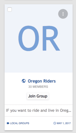
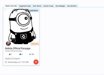
To a new user, they don't know what's hidden behind there and on many groups it's actually very difficult to see that menu due to the image used, for example:

Please add a dedicated 'Join Group' button in the bottom half somewhere.
A user should not have to hunt around for this.
I had trouble with this myself when first testing the group on this website.
It was incredibly frustrating not being able to figure out how to join a group, I'm sure other users have experienced the same.
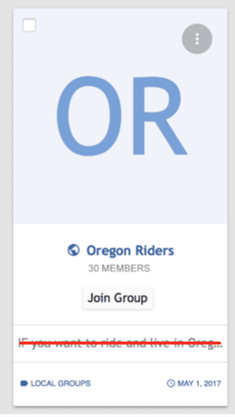
It should be easy peasy:

To a new user, they don't know what's hidden behind there and on many groups it's actually very difficult to see that menu due to the image used, for example:

Please add a dedicated 'Join Group' button in the bottom half somewhere.
A user should not have to hunt around for this.
I had trouble with this myself when first testing the group on this website.
It was incredibly frustrating not being able to figure out how to join a group, I'm sure other users have experienced the same.
It should be easy peasy:
