Question Groups are confusing my mobile users. See screenshot

alfa1

Well-Known Member
This is what a group looks like on mobile. The first wave of members are testing out Nobita groups. Most think that groups do not work. Because they use mobile and only see the wall page. Due to the design of the page the Forums and media links are hidden under the hamburger menu. The wall page shows the editor so they think this is the main group discussion function. They think full groups are EMPTY, too confusing and don't like this. Then they leave and never use it again.
Please consider a way to improve the wall and to avoid confusion.
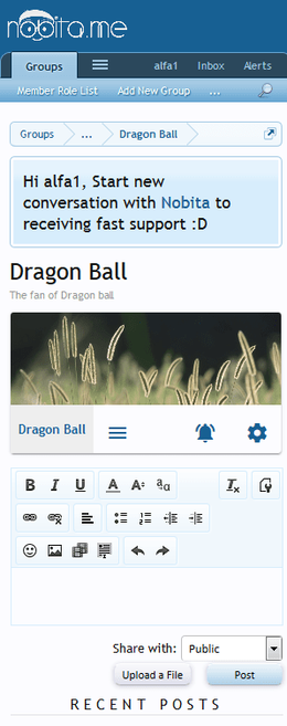
screenshot-nobita.me-2016-10-31-12-34-29.webp

Mind that this group is full with activity. Has threads, media, etc. But the user never sees it unless he clicks the hamburger menu.
On my site I have groups with 1100 members and a mass of threads, media. But on mobile it looks like the groups are empty.

70% of my users are on mobile.
 
In first sight, I feel a few more newsfeed on wall will help you get what you need. without change of anything. am I right? newsfeed from all over the group (media, forum and ...) and be able to update it (post, comment and ...) right from those newsfeed. NO?
 
I think Nobita's idea is good. A newsfeed on the group home page is a very good idea. But the current layout doesn't work well.

We need a better comment box:
The wall full editor box is all users see. It takes up the whole screen. It should not be visible on first page load and not with full editor. Look at facebook and google+
screenshot-plus.google.com-2016-10-31-13-16-45.webp
That G+ comment box does not take up the whole screen. The simple editor that @Nobita already created for comments needs to be used.

Can't have 2 separated discussion functions.
Another issue is that currently we have group discussion forums and wall discussions as two separated content types. One of them needs to be turned off as we cant have two places for discussion. Or it needs to be integrated so a wall discussion is a group forum discussion. As it currently is, people will just think the group wall discussion is THE discussion function.

Newsfeed needs to show everything.
The newsfeed doesn't show the most important things like forums and media. It would really help if this will be added.

Improved Layout
The newsfeed needs to be more compact and have a better layout.
Images in the newsfeed all have different sizes. Some images are larger than mobile screen.
All images/media should be thumbs of the same size / height.
Comments need to be smaller like on Facebook.

Please show links to forum and media on mobile. Hiding the links in the hamburger menu is not a good idea. Member do not find it there.
 
The simple editor that @Nobita already created for comments needs to be used.
alfa1Simple editor is good, but please make it optional. (we let users use editor for posting in wall)

Please show links to forum and media on mobile. Hiding the links in the hamburger menu is not a good idea. Member do not find it there.
do you have any idea for how to show them on mobile? recently I reported something that our groups mostly have long name (not so long. but not just one word) then imagine we also show forums and media tab next to it. where to place them? if you have a nice idea that how to show them in mobile, then I'm interested in knowing what you have in mind.

Another issue is that currently we have group discussion forums and wall discussions as two separated content types. One of them needs to be turned off as we cant have two places for discussion. Or it needs to be integrated so a wall discussion is a group forum discussion. As it currently is, people will just think the group wall discussion is THE discussion function.
now we can let users of group to comment, but not post in wall.

If nobita adds all other newsfeeds, then you will be able to disallow users to post in wall, but be able to comment. then you will post in group's forums and then users will just be able to comment on their newsfeed in wall (and those comments will be as replies to that thread)
 
Simple editor is good, but please make it optional. (we let users use editor for posting in wall)
DadparvarDo like G+. Show simple comment first but show full editor in overlay when they click it.

do you have any idea for how to show them on mobile?
Yes, show the FORUM, MEDIA link under the group name. Let us define sort order.
 
I wonder if there's a way to set up a sidebar block to display recent/trending/popular topics that are specific to each group?

I know with Widget Framework you can specify the location. Set it up to display on the group home page, and this could solve the problem, somewhat.

Only thing I'm not sure about… if it will follow the permissions of each group. Like group 1 would only see their posts, group 2 would only see their's, etc.

Just a thought, I haven't tested this at all.
 
@Nobita what do you think?
Its a serious problem for us. We get very bad feedback from our members.
They say they do not want a migration to xenforo because groups confuse them too much.

How to best resolve this?
 
Add an alert with new posts from the forum section on the forum tab, like an alert bubble, as a call to action. It could appear on the hamburger if the forum tab is hidden.

IMG_7355.PNG
 
Back
Top