alfa1
Well-Known Member
Read this: https://nobita.me/threads/group-card-banner-display-issues.1677/
To have a group card which can fit a good description, a large JOIN button, member avatars and which will not be cramped, it will need to be wider and less in height.
Example of cramped cards in Nobita groups:
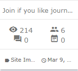
You cant read anything here.
Example in IPS clubs shows how wider is better:
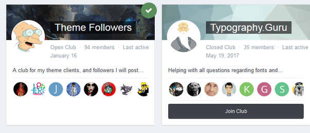
This means that for group listing there can only be 2 columns maximum. Please vote if you want this.
@Freelancer @Dadparvar @hollosch @ehd @jOOc @RvG @RobinHood
To have a group card which can fit a good description, a large JOIN button, member avatars and which will not be cramped, it will need to be wider and less in height.
Example of cramped cards in Nobita groups:

You cant read anything here.
Example in IPS clubs shows how wider is better:

This means that for group listing there can only be 2 columns maximum. Please vote if you want this.
@Freelancer @Dadparvar @hollosch @ehd @jOOc @RvG @RobinHood

