You are using an out of date browser. It may not display this or other websites correctly.
You should upgrade or use an alternative browser.
You should upgrade or use an alternative browser.
Implemented Clicking anywhere in the group tile should open the group
- Thread starter alfa1
- Start date
SoeHoe
Member
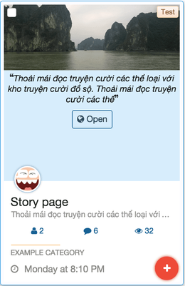
This is my idea
Join Group become Join. Of course other user already know that it is a group, so just name it Join.
Join button and Closed button resized to smaller size.
Short description displayed when a group hovered. Group name can be "Description" or "Information"
Which one is better? Full block or half block.

Thanks to @Nobita for making this excellent add on.
Join Group become Join. Of course other user already know that it is a group, so just name it Join.
Join button and Closed button resized to smaller size.
Short description displayed when a group hovered. Group name can be "Description" or "Information"
Which one is better? Full block or half block.

Thanks to @Nobita for making this excellent add on.
alfa1
Well-Known Member
This is my idea

I dont see why we need 2 Join buttons. There is a big + sign and a join button. Both do the same.
Also: if a group is locked then no one can join, so in this case there should not be a join button.
I think all 3 buttons can be reduced to 1 button.
-
Implemented Share this social group bb code / card.
- Started by alfa1
- Replies: 9
- Resolved Suggestions
-
Implemented Hide events icon if there are no events.
- Started by alfa1
- Replies: 2
- Resolved Suggestions
-
Implemented Most threads tab on group home
- Started by alfa1
- Replies: 0
- Resolved Suggestions
-
No Thanks "Default Tags" for Group Forums needed
- Started by Freelancer
- Replies: 2
- Resolved Suggestions
-
Implemented Prefixes for Forums
- Started by Freelancer
- Replies: 3
- Resolved Suggestions

