mauzao9
Member
Hello there.
I have been trying to fix many CSS issues with this addon and Black Responsive style, but i'm stuck trying to deal with it here:
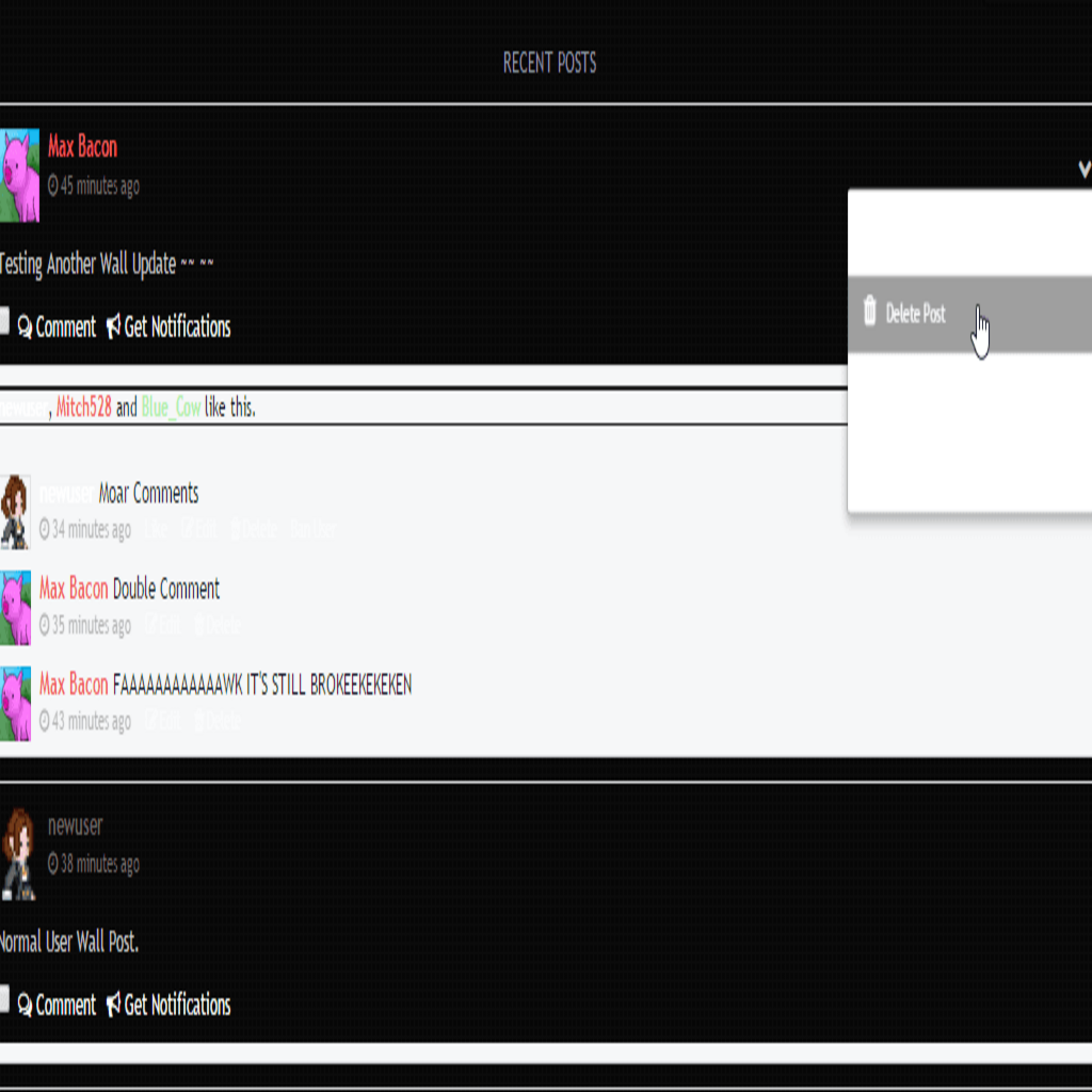
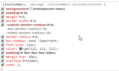
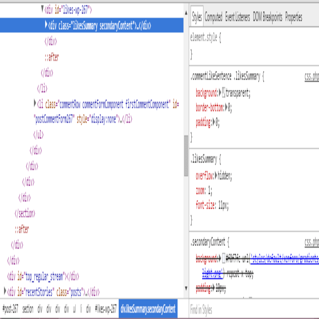
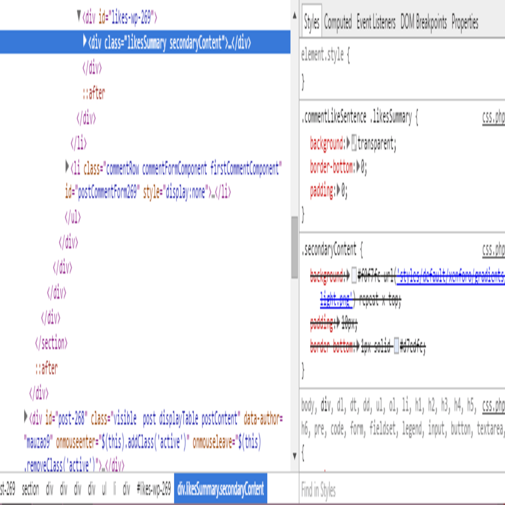
I don't even know what templates to target, seems it's spread across several templates, and it has spacing that doesn't exist on default style, it also bugs with the style "heart like" (that doesn't appear on the wall for some reason).
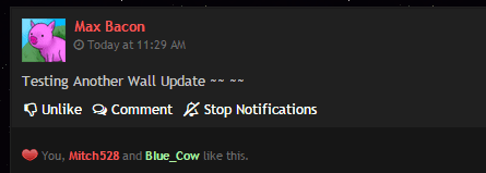
I had removed several CSS settings from Team_post.css (.commentRow.firstComponent, .commentRow.firstCommentComponent, etc..) and kept editing till i achieved something like this: http://i.imgur.com/kgCbraf.png
I still have issues with: Spacing (from likes / comment start on wall), heart icon being overlapped, heart icon not displaying on wall. And the Post Menu, where do you edit that?
Can i ask for help? It displays differently on wall and on full (direct link) to post, like the heart icon on full view, and the "box" involved likes on the wall view are extremely confusing.
Full view example http://ilovebacons.com/groups/posts/16/show?focus=1&comment=1 (should be public)
I have been trying to fix many CSS issues with this addon and Black Responsive style, but i'm stuck trying to deal with it here:

I don't even know what templates to target, seems it's spread across several templates, and it has spacing that doesn't exist on default style, it also bugs with the style "heart like" (that doesn't appear on the wall for some reason).
I had removed several CSS settings from Team_post.css (.commentRow.firstComponent, .commentRow.firstCommentComponent, etc..) and kept editing till i achieved something like this: http://i.imgur.com/kgCbraf.png
I still have issues with: Spacing (from likes / comment start on wall), heart icon being overlapped, heart icon not displaying on wall. And the Post Menu, where do you edit that?
Can i ask for help? It displays differently on wall and on full (direct link) to post, like the heart icon on full view, and the "box" involved likes on the wall view are extremely confusing.
Full view example http://ilovebacons.com/groups/posts/16/show?focus=1&comment=1 (should be public)
