RobinHood
Active Member

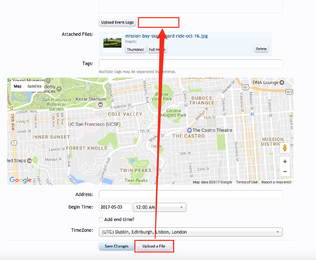
Currently when you attach extra files to an event description, the button to do so is at the very bottom.
When a file is finished uploading, the 'Attached Files' area is waaaaay above it.
I thought the button was broken when I first used it as the 'Attached Files' area was off screen, so I didn't see confirmation that the the file I was trying to attach uploaded successfully.
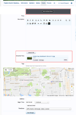
Here's a mockup with a proposed suggestion to move the 'Upload a file' button closer to the editor, and next to where the uploaded files appear as attachments.
Plus I've changed the 'Upload event logo' button and moved it above the editor to help better reflect that it's the main event image / cover photo.

