Improve Main Group Page

alfa1

Well-Known Member
When members access a group they see this on mobile:
Screenshot-2017-10-4 Dragon Ball.webp

They cannot see group discussions.
They cannot see group images.
They cannot see group members.
They cannot see group information.
They cannot see group event.

Asides the group wall there is nothing to see and they leave again.
Please improve this, because its a big problem for us.
 
Alright then.

Foreword: I made this to show a way to use the Wall as a "News Feed" like wall and get away from mixing news feed and posts together. In my honest opinion the post functionality for the wall cannibalizes the forum feature of social groups. In no social groups software on the internet you have both wall posts and forums. Only one thing or the other.

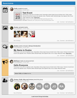
This mockup was made with Photoshop (to be fast) and can be transformed into HTML of course. It is a STRUCTURAL Layout, not finalized and not "material" design. So ignore colors, fonts etc... But to use the "Cards" more efficiently it would be great if every card stands for one news item like a new "thread", "member", "media" (missing yet), "event", "announcement" (missing yet) etc...

GET RID OF WALL "POSTS": Remove the functionality and let only Group Admins be able to make/post an "announcement" (see screenshot mockups)... Remove the Redactor Editor from the wall and save space. Less is more...

COMMENTING ON CARDS: Only show the simple form field (like it is now) IF someone clicks on "comment"... Less is more...

DESKTOP VIEW
group_wall.webp

MOBILE VIEW
group_wall_mobile.webp
 
It`s a great modification if it`s will be implemented to groups. The current wall is quite frankly not a good look.
In General, many waiting for a version for XF2 :) and me too.
 
Back
Top