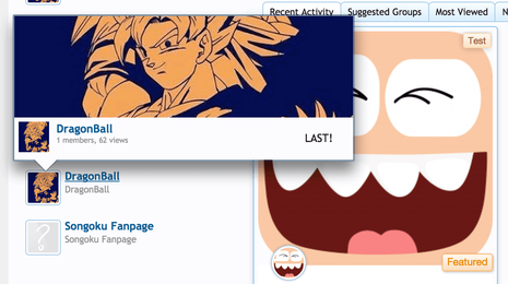
Implemented Give us options for sidebar block display

alfa1

Well-Known Member
The new design for sidebar blocks is nice. It takes more space but looks good. But it doesn't work well for sites with many groups to show.
Different people need different things.
Please give us settings to show blocks in the standard view (like it was before) or the new design.
This way everybody can choose.
 
If you do not want to add settings, then please do not implement the new changes. Its the group home page so it really needs to provide a good overview. With the new design it becomes confusing when there are a lot of groups. We will not be able to use nobita groups if the homepage is too confusing.
 
I agree with @alfa1, an option to turn if on/off is always good. Just because you like it doesn't mean every one does.
 
I am generally a big fan of Settings ;)
Because as developer you may think you can make an Overall solution, but it always will be that other users have other Needs, or like another design.

With Settings in the ACP, it always is better to get 1 Setting more then you are forced to have to use a new Feature, style you don`t like :(

I stuck at Nobita v2.2.8 - because it is working good for me, and I am always afraid of updating.
When the Taiga Group Chat should be released, I will update - thats 4 sure ;)

Erich
 
Oh yes. I have remove that layout and make it into preview. :)
 

Attachments

  • Screen Shot 2015-05-08 at 5.28.30 PM.webp
    Screen Shot 2015-05-08 at 5.28.30 PM.webp
    117.6 KB · Views: 76
Back
Top