Truonglv
Took a shot at trying out the Android version of the app.
1. Bookmarks don't work. Bookmark does not appear. Also once selected it shows as pre-selected for all posts.
2. Push notifications don't work if Delay notifications checkbox is enabled.
3. Search should throw a warning if user uses phrases < 4 characters as that seems to be a limitation for you. Right now it just says no results which is incorrect.
4. Can't seem to upload video at all. Should be added if it's not a bug.
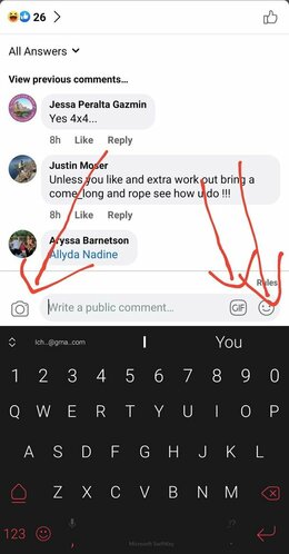
5. You should add an easy to reach attach media and emoji button to the comments bar. Follow Facebook's example as per attached. Attaching media is very challenging and confusing at the moment.
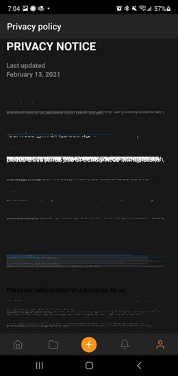
6. Privacy notice page looks corrupt
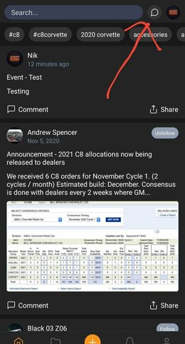
7. Important buttons like Conversation are too small and easy to miss and instead you dedicate too much space to search which is much used much less. Recommendation is to increase size/width of Conversation and Account, reduce search or make it a pop out.
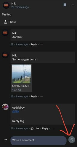
8. The post button seems to be top aligned, it should be center aligned or match height of the comments input bar. Looks odd.
I will report back with more findings.
Thanks for your time.
Took a shot at trying out the Android version of the app.
1. Bookmarks don't work. Bookmark does not appear. Also once selected it shows as pre-selected for all posts.
2. Push notifications don't work if Delay notifications checkbox is enabled.
3. Search should throw a warning if user uses phrases < 4 characters as that seems to be a limitation for you. Right now it just says no results which is incorrect.
4. Can't seem to upload video at all. Should be added if it's not a bug.
5. You should add an easy to reach attach media and emoji button to the comments bar. Follow Facebook's example as per attached. Attaching media is very challenging and confusing at the moment.

6. Privacy notice page looks corrupt

7. Important buttons like Conversation are too small and easy to miss and instead you dedicate too much space to search which is much used much less. Recommendation is to increase size/width of Conversation and Account, reduce search or make it a pop out.

8. The post button seems to be top aligned, it should be center aligned or match height of the comments input bar. Looks odd.

I will report back with more findings.
Thanks for your time.
Last edited:
