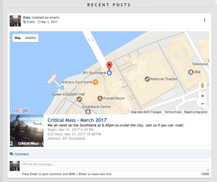
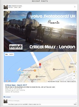
Event photos get cropped down to a square, they would be more suited as cover photos

RobinHood

Active Member
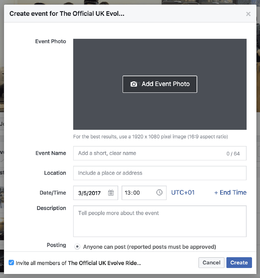
Similar to Facebook and XenAtendo, most users are accustom to creating landscape event photos.

These get cropped down to a square in Groups, which isn't great.

Please change it (or allow an option) so that group images are all cover photos.

They would have a greater impact when scrolling down the wall, and are better suited to the types of event photos users make for other social media sites.


The Wall:
upload_2017-5-2_14-13-54.webp


The actual event:

upload_2017-5-2_14-14-45.webp
 
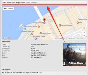
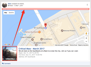
Sorry, I was trying to explain that it would make sense to move the photo location from the square photo in it's current location, and be moved to where the arrow is pointing, so instead we have a full width cover photo across the top of the map instead.

This is more inline with other events systems and also makes it more mobile friendly at narrow screen widths, because you can have all the info stacked nicely

Cover Photo
Map
Event Information

I have users that often create multiple events on Facebook and also for XenAtendo, they will also be making them in groups.

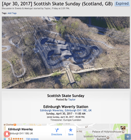
Both Facebook and XenAtendo utilise wide landscape cover photos for events.

Many users spend time putting a lot of effort into making exciting event photos in a landscape format for these events, however when they try to use it here, the image gets cropped down to a square and lots of the info can be lost if they also had text in the event image.
 
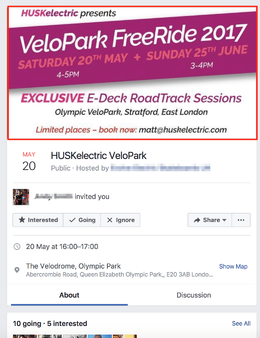
Example of an event on facebook with a full width landscape cover photo, the author has lots of text in his photo that would be cropped off if we only use squares.

upload_2017-5-3_11-44-11.webp
 
I think the 'Event logo', as you've called it, should instead be an 'Event Cover Photo', or just 'Event Image', which is a cover photo. Even leaving it called 'Event Logo' is fine, but I would much prefer it to appear as a cover photo instead of the small square next to the description.

Cover photos have a bigger impact overall, and are look much better on mobile (50% of users), and also fall in line with other events systems that my users are used to.

They get frustrated when they upload the cover photos they made for other events systems and the image gets cropped down.
 
Here's a mockup which would allow a fixed width cover photo (heigh adjustable, so nothing gets cropped).

It's also much more friendly to mobile and small screens as each section is stacked and not crammed on the same line.

This is a big consideration as half of much forum traffic these days is on mobile.


BEFORE:

upload_2017-5-8_13-45-20.webp


AFTER:

events mockup.webp
 
Back
Top