
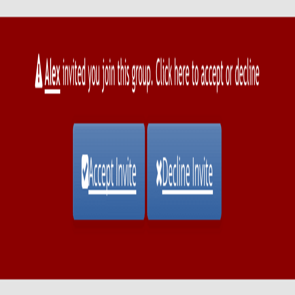
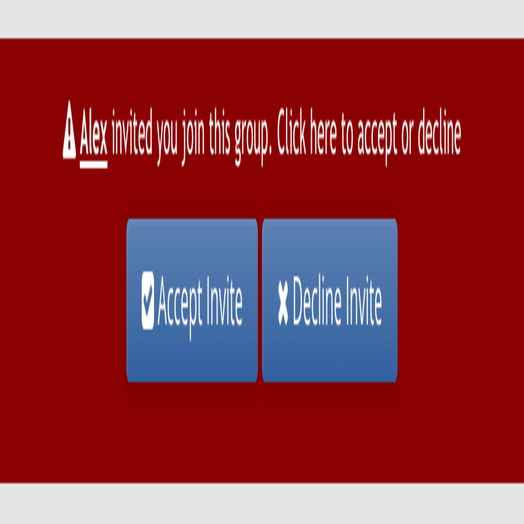
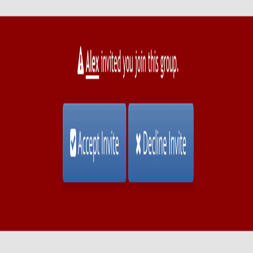
Implemented Styling improvements to the invitation screen
- Thread starter RobinHood
- Start date
")
-

Implemented Share this social group bb code / card.
- Started by alfa1
- Replies: 9
- Resolved Suggestions
-
Implemented Hide events icon if there are no events.
- Started by alfa1
- Replies: 2
- Resolved Suggestions
-
Implemented Most threads tab on group home
- Started by alfa1
- Replies: 0
- Resolved Suggestions
-

No Thanks "Default Tags" for Group Forums needed
- Started by Freelancer
- Replies: 2
- Resolved Suggestions
-
Implemented Prefixes for Forums
- Started by Freelancer
- Replies: 3
- Resolved Suggestions